Users needed to understand three things about campaign performance: how badly a campaign was under-delivering, how much budget it would spend if nothing changed, and how much budget remained available. This information was only accessible through manual spreadsheets and custom calculations manual spreadsheets and custom calculations, time-consuming for experts and inaccessible for beginners.
Research & approach
I began with user interviews with Performance Analysts and Product leads to understand how they made pacing decisions — what data they needed, how they currently worked around the gap, and what "good" looked like to them.
Key findings shaped the design direction:
- Experienced users needed multiple time-period views (24h, 48h, 72h) to identify trend direction — not just current state
- A campaign "catching up" on delivery looked the same as a consistently under-delivering campaign in a grid view
- Beginners needed a single clear signal: is this campaign okay or not?
- Budget availability, how much more could safely be added, was impossible to assess without knowing projected spend.
I translated these findings into high-fidelity wireframes in Adobe XD, iterated with user feedback, and worked closely with the engineering team on feasibility throughout.
Key visualizations
Three chart types worked together to answer the questions users actually had:
Line chart - Actual vs. Target Spend
Showed spend trajectory over 24, 48, or 72-hour windows with a projected future spend line. Made it immediately visible whether a campaign was trending toward delivery or falling further behind, and distinguished "catching up" from persistent under-delivery.
Completion gauge - Projected, Lifetime, Recent
A dial-style chart showing how much of the target budget had been spent, with three selectable modes: Projected (where the campaign will end up), Lifetime (overall), and Recent (current pacing trend). Gave beginners a single, readable health signal.
Stacked bar chart - Budget breakdown
Visualized spent budget, remaining available budget, and potential budget increase side by side, with a sticky tooltip for precise values. Directly answered the question experienced users had no other way to assess: "how much more budget can this campaign absorb?"
The Final Product
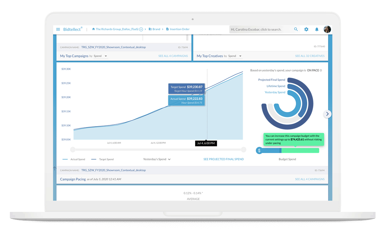
Deployed dashboard: spend trajectory, completion gauge, and potential budget increase in one view
Outcome
- Experienced performance analysts no longer need spreadsheets or custom calculations for pacing decisions
- Beginner and self-serve users gained clear, actionable visibility into under-delivery status
- The "catching up" scenario, previously invisible in grid views, was now visually distinct from persistent under-delivery
- Both expert and beginner workflows served by the same interface, through progressive information density